Blog
.jpg)
Atiya Wells Awarded NRF’s 2024 Crawford Prize
“When I found out I won the Crawford Prize, I was surprised. It’s heartwarming to know the impact we have on our local community is being seen and heard across the country. We just turned five. But we really hit the

LGBTQ+ Youth Thrive in Supportive Environments
Research shows that the discrimination experienced by LGBTQ+ youth because of their identities is linked to an increased risk of suicide and lack of access to mental health care. This finding comes from a 2024 survey of
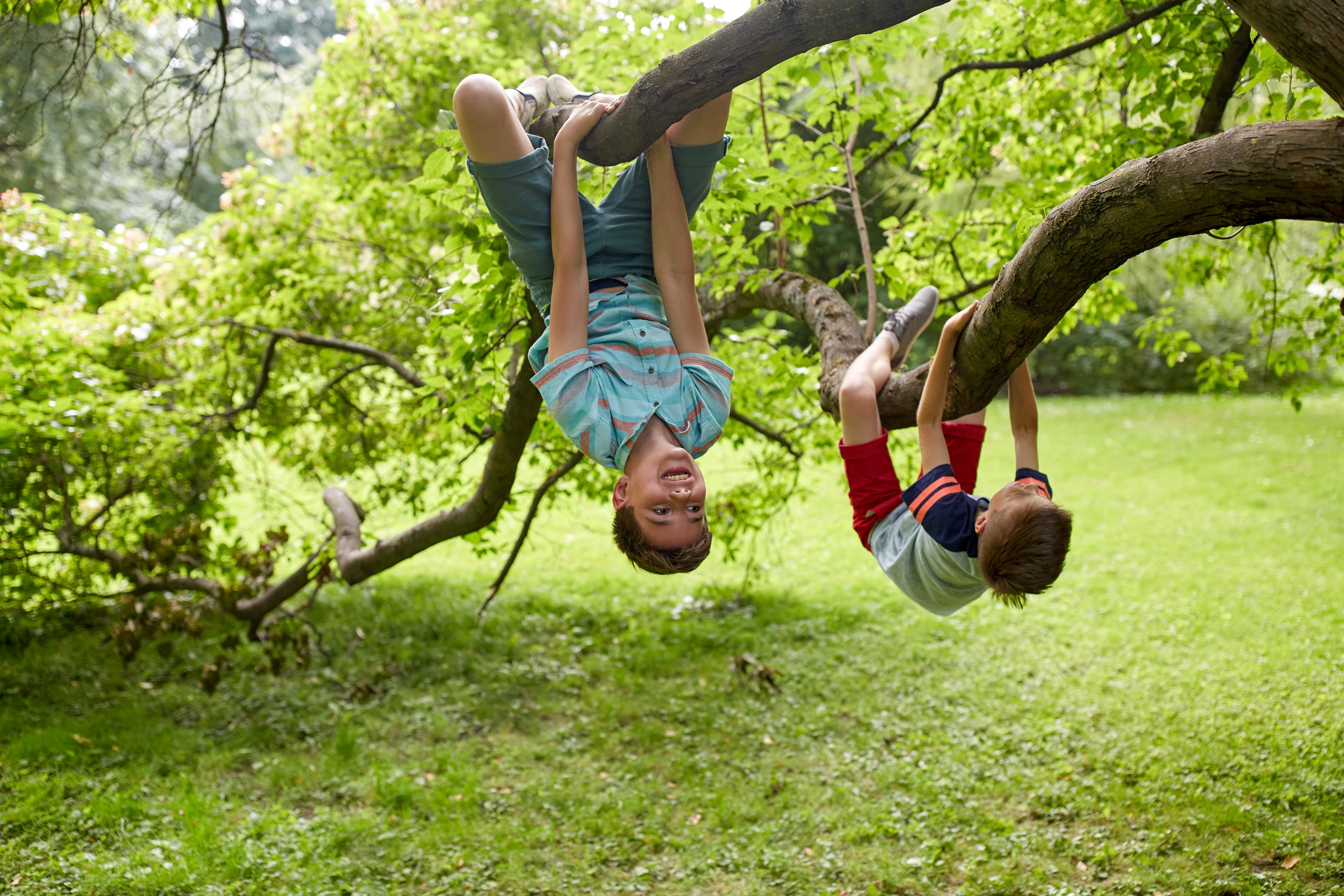
Extracurricular Programs are a Core Component of Youth Development
While school-based learning is an essential part of children’s development, out-of-school-time is equally important for kids’ growth. Out-of-school-time includes everything from summer camps to after school
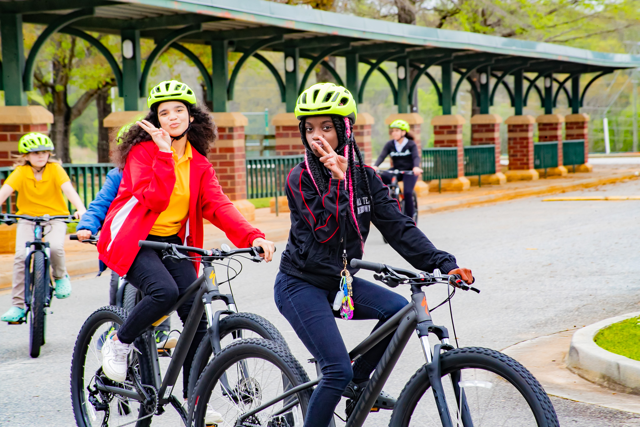
CREATE Cyclists Gain More Than Bike Skills
In outdoor education, the recreation activities often look like the most exciting part. Whether it’s canoeing, cycling, or hiking, it’s easy to get caught up in counting miles, comparing gear, or assessing
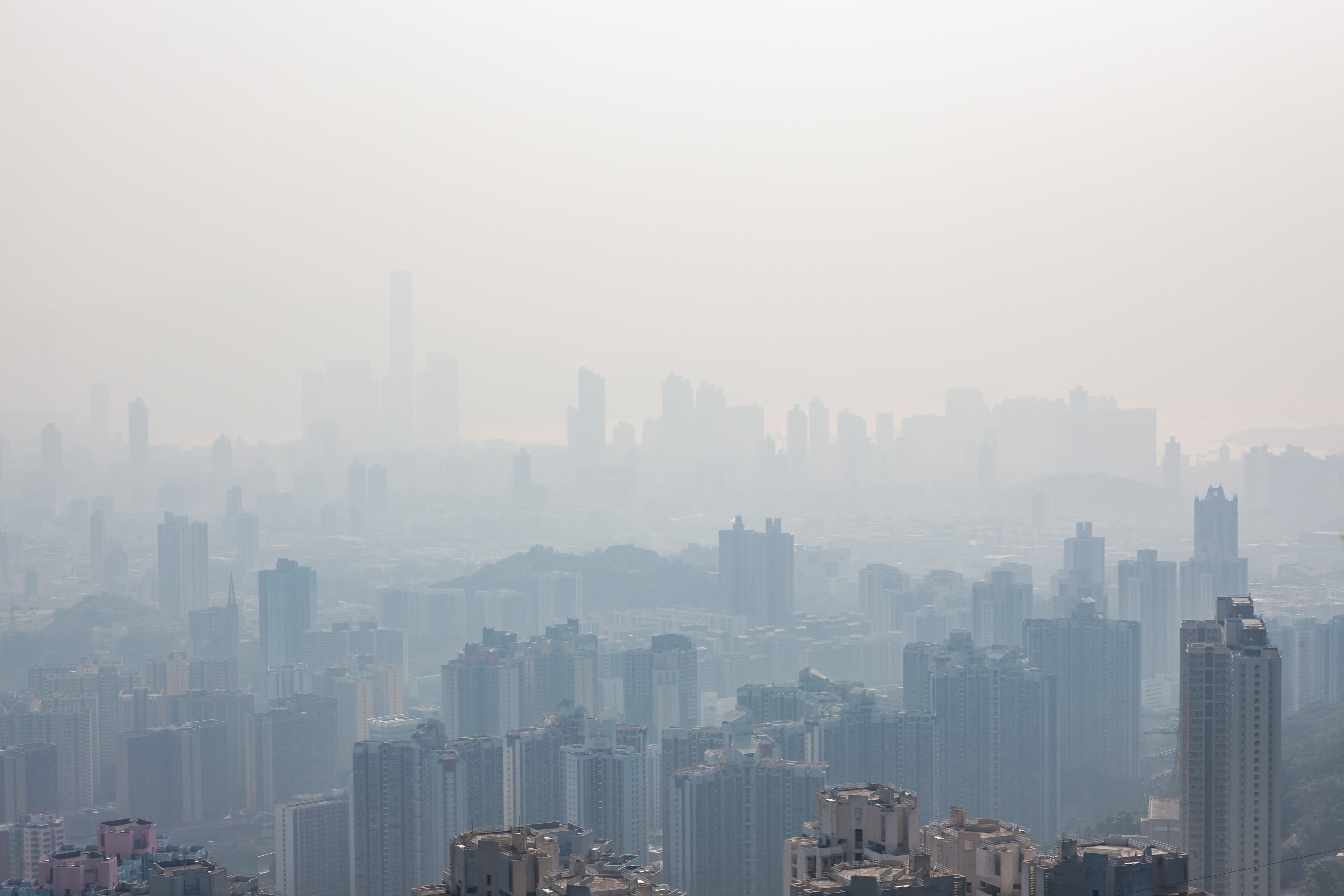
Justice-Based Climate Action is Essential
Climate change is complex. This is true in terms of its drivers, its impacts, and our responses to it. The State of Global Air, a report that was published in 2024 in partnership with UNICEF, notes that air pollution is
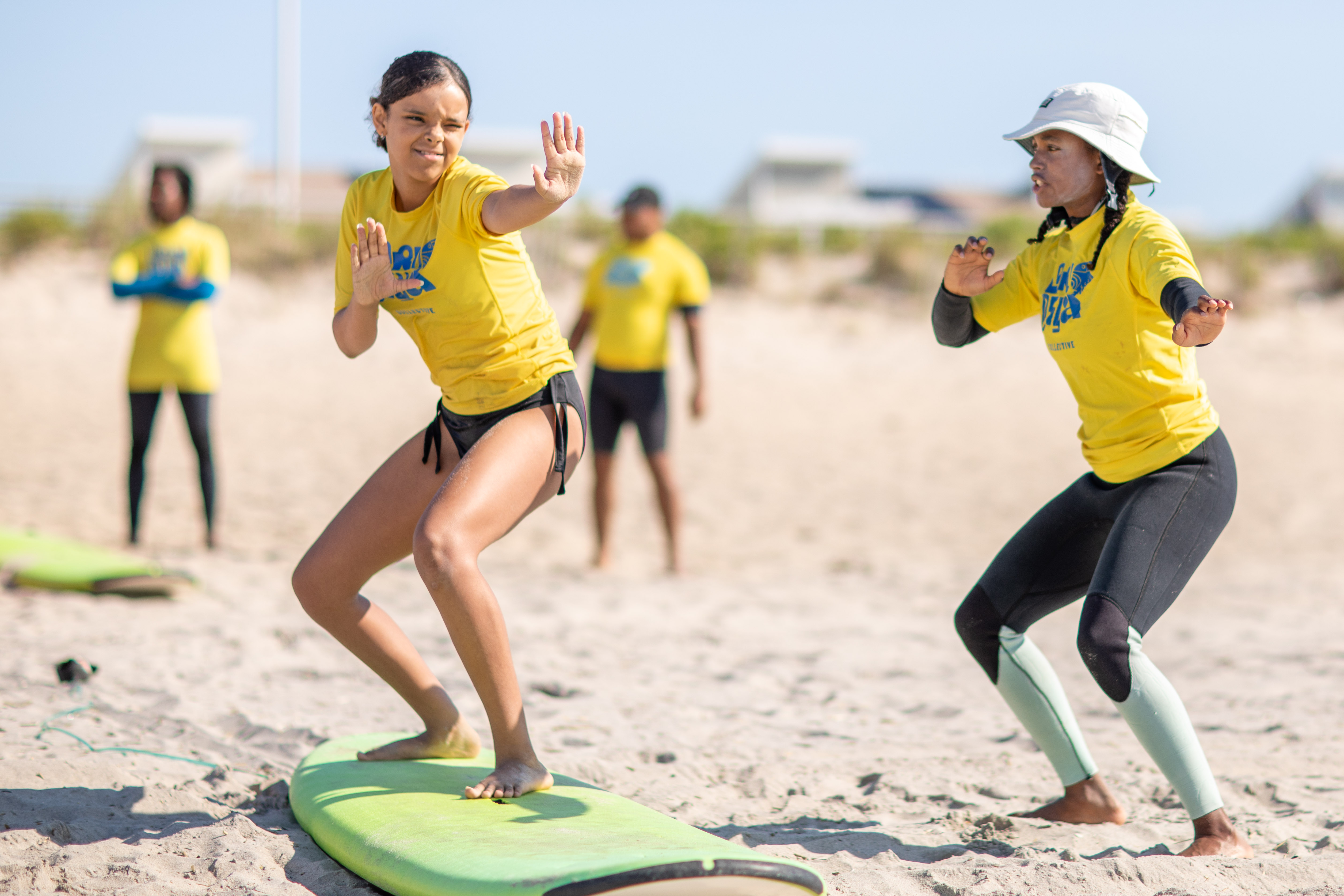
NRF Welcomes New Cohort of Outdoor Grant Recipients
NRF is excited to announce a new cohort of Outdoor Grant recipients. The grants will serve thirteen community organizations located in eleven different states plus Washington D.C. Each organization takes a unique

Formative Experiences Influence Career Trajectories
A whole range of factors can influence the career path a person chooses. Salary ranges and job security are logistical considerations. Less tangible concerns, like emotional fulfillment and a desire to create positive